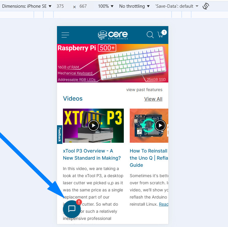
Surely I’m not the only customer who finds it annoying to have that “Chat Support” pop-up blocking the bottom left corner of the screen, so that we are unable to continue reading the product information which is actually important ?
The speech balloon icon is already in an especially prominent location … but to force it to pop-up seems to assume that we are too stupid to use it if we do need help. Why is it preferable for customers to have to close the unwanted pop-up multiple times (especially when using multiple tabs to compare almost identical products) rather than to click the speech balloon icon once if needed ?
Why the bottom left corner ? We read left-to-right, so there will always be text on the left side; and bottom is the latest information that we have scrolled down to. If it had it popped up in top right corner it would be so much less intrusive.
And why automatically assume that every customer who visits your website for more than 60 seconds needs assistance ? Certainly your search engine is decidedly unhelpful - adding a second keyword increases exponentially the number of results returned instead of reducing them - or maybe it is just that I haven’t taken the effort to learn how to change its default from OR to AND. Certainly other websites show one product and allow the customer to choose variations like colour or length without having to wade through 2 dozen entries in the search results. But surely that should not require an online support person to get involved with every sale.
It all really gives the impression that you would prefer me to find another supplier - which is a pity since you stock almost all the products that I was previously buying from overseas suppliers, and the convenience well outweighs the extra cost.
This is good feedback, so I can better orient myself on this. What type of device are you using?
We built the chat module, so we can do whatever works best. Depending on the device and screen you are using, a number badge might be better and less intrusive. Let’s start with testing on the device you are using. Let me know.
And regarding search, that’s valid. We use Elasticsearch in Magento, which is why you see what is happening:
higher relevance for those that match both words
less relevance (albeit more variations) for those that match either word.
… but there will be more products.
A lot of work is going into a vector search system behind the scenes, built on well-composed embeddings. Experiments are going well, and we’re excited to make that the new norm.
Just wanted to add here @Donald23173 that I’ve rolled out the below change that does this for narrow devices such as phones. Can you please hit your browser with a hard refresh?
Let me know if that’s a good middle ground - am also about to hit send on a hide chat which will remove the chat for the next 24 hours if there is some critical reading to be done, will be available via the chat widget menu.
Being of the older generation I find phones useful - but the screens are too small for any real work
I do like that you have the Chat Support, and my big complaint is that it pops up without me asking for it, and secondarily that it pops up in the most inconvenient place.
Maybe it is popping up due to some unintended browser programming ? I did some website support years ago, and I guess browser compatibility is still an issue.
I note that your website seems designed for a fixed maximum page width … and that there seems plenty of clear space in the bottom right corner. I think placing the speech bubble icon in the bottom right corner it would still have good visibility. And when a user clicks on it, would it be feasible to pop up nearer the top right corner ?
Good info. Do you enable any extra security settings that might get in the way of local storage being cleared each visit?
If so, and at worst, both of these features are live:
Chat menu → Disable auto expand
Chat menu → Disable chat
Both require local storage to persist, though would remain set the entire session.
And it’s a good idea to CTRL+Shift+R to hard refresh if you want fresh assets.
There are no scenarios where the widget keeps popping up every 60s. If that’s happening after a hard refresh, can you please share your console log (F12 → console) after a couple hit?
I note that your website seems designed for a fixed maximum page width … and that there seems plenty of clear space in the bottom right corner.
The template should center align, and end up with white space either side. We’ve rolled left side chat for almost 11 years, while this is the first time feedback has bubbled to the surface, we’ll check it out.
You’re definitely not the only one. Those auto chat pop-ups can be really disruptive, especially when you’re reading specs or comparing products in multiple tabs. It would make much more sense if chat stayed minimized unless you click it, or at least appeared somewhere less intrusive. Hopefully the team takes this feedback seriously, because the product range is great and it’d be a shame if the UI pushed customers away.
What popup text are you seeing that does not go away (and stay away)? There are no scenarios where that ought to happen.
The greeting is once, and only if there are technicians/engineers live on chat at the time. No different than the red shirt at the front of a Bunnings store. Far more people are new to electronics than seasoned professionals, and seem to appreciate the soft landing.
Let’s get this fixed, so we can strike the right balance. Let me know, so we can fix it!
Ok, I think I found a niggle. The second welcome, which is worded differently, had a missing rule. While it did not repeat every 60 seconds, some would have received 2 messages almost back-to-back.
Annoying! And fixed. Let us know if there’s anything we can improve. Always keen to make things better, and there are a tremendous number of projects going on behind the scenes @ Core that never break the light of day (maybe they should).
What really helps are screenshots and/or a way to replicate. This would have been hard to replicate without knowing a few things. But a screenshot would have been sensational.
Thanks everyone, I’ll get back to building features for this new ERP!
Ummm, not sure about that. Every so often I try to check all the privacy settings, turning off all those which sound unnecessary. I don’t touch microsoft products,and only use google chrome for my Home Assistant (since ESPHome Builder requires WebSerial).
My Firefox settings include Browser Privacy set to “Standard”. I understand the benefits of cookies and temporary cached files (including core-electronics.com.au), so have not selected “Delete cookies and site data when firefox is closed”.
I have turned off permissions for Location, Camera, Microphone, Speaker, Notifications, Autoplay and Virtual Reality; and “Block pop-ups and 3rd party redirects” and “Warn when websites try to install add-ons”.
Where should I find the “Chat menu” settings ?
Yeah… shortcut keys can be handy … if you use them regularly like CTRL-C and CTRL-V. But i’ve used so many different application that I can’t be bothered learning all the keystrokes, especially where there is a GUI button to do the job.
FYI, my employer held up release of new PCs so we could have the “benefit” of Windows 95 the day it was released - and fortunately I haven’t had to reboot my PC every night since.
This time the pop-up blocked the entries I was reading when I was about halfway down the first page of search results in my main browser window. It does not keep popping up … however I often open products in other browser tabs to make comparison easier, and sometimes the pop-up appears in all the tabs. Only very occasionally, just annoying when it does.
I know I have sometimes expressed frustration to your support people, and they respond with an apology and marking my IP to prevent it happening again.
I totally feel your frustration.. There’s nothing more distracting than trying to read a technical guide or compare parts only to have a chat bubble block your view every few seconds.
While I understand why businesses use them for quick support, maybe a less ‘aggressive’ version, like a small, static button in the corner that doesn’t expand automatically, would be a better balance? It would definitely make the browsing experience much smoother for those of us who just want to focus on the content.
Hopefully, the Core team can look into a more subtle implementation…